What it means
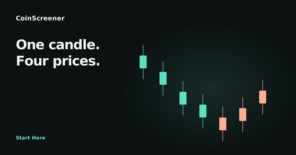
The open is the first price of the interval and the close is the last. The high and low mark the extremes reached. The body joins open and close, while the wicks extend to the high and low.
Imagine a candle that opens at 100, reaches 105, falls to 98 and closes at 103. Its body runs from 100 to 103, with wicks reaching 105 and 98. Those four values, often shortened to OHLC, summarise the interval. The finished candle alone cannot tell you whether 105 or 98 came first.
In these lessons, aqua means the close is at or above the open and coral means it is below. Platforms can use other colours, so read the underlying values rather than relying entirely on colour.
During a live interval, the latest candle is still forming. Its high can increase, its low can decrease and its latest price can move back and forth. An apparent breakout can disappear before the close.
After the interval ends, its open, high, low and close summarise that completed interval. A close beyond a level is therefore a different observation from a brief intraperiod move through it. Neither guarantees follow-through, but they answer different questions.
In CoinScreener
A one-hour chart uses one candle per hour; a four-hour chart uses one per four-hour interval. A properly aligned four-hour candle combines four one-hour intervals: the first open, highest high, lowest low and last close. Daily and weekly charts aggregate still more activity.
Aggregation can hide the path. A small daily body might contain a large rally and decline. Shorter charts reveal more detail but also more fluctuations that may be irrelevant to a longer-horizon decision.
Confirm the symbol, venue, market type and alert timeframe in the detail screen. The market-context chart explains the observation; supporting indicator panels correspond to the plotted history. Delivery can happen after the candle close, so the market may already have moved.
A chart viewer's interval and a strategy's evaluation schedule are separate. Viewing another interval does not change a published Polaris strategy, its historical evidence or its trade management.
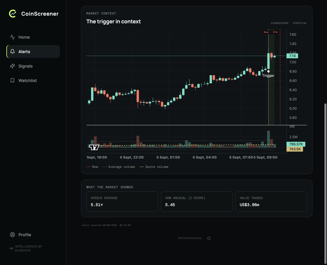
This 1000BONKUSDT alert uses five-minute candles. Bodies and wicks describe each interval; the volume panel shares the same time axis. The trigger marker identifies the observed candle, and no later candles are included in this capture.
Three checks
- Know which interval each candle summarises.
- Read open, high, low and close separately.
- Align price and indicator timestamps.
Explore examples
Explore the chart lesson
Use Next to reveal completed candles. Compare each body with its wicks, then with the candles around it. Every candle represents the same length of time; the prices are hypothetical.
One candle, four prices
Each candle has an open, high, low and close. The body joins open to close; the wick extends to the high and low. Up and down describe the close relative to the open.
Illustrated walkthrough · all scenarios
Read the candles
- One candle, four prices. Each candle has an open, high, low and close. The body joins open to close; the wick extends to the high and low. Up and down describe the close relative to the open.
- A sequence gives context. These are equal-length intervals. A small candle says little by itself; compare its range and location with nearby candles.
- A large range. Compare the full high-to-low range with the body. The wicks show how far price travelled beyond its open and close; they cannot tell you what the next candle will do.
- Wait for the close. Playback adds completed hypothetical candles. On a live chart, the latest high, low and closing price can change until the interval ends. Four aligned 1h intervals make one 4h candle.
The volume bars refer to the same intervals as the candles above them. A tall volume bar describes more trading; it does not change what the four candle prices mean.
Sources
Product behavior checked against V3 source on 9 September 2026. Screenshots retain their original capture dates.